


The Real Problem With The JaGUar Rebrand
This week in corporate fuckery, we have a spectacular failure for a storied brand. Come pick it apart with me!

I know a lot of people have already spoken on what a completely disastrous rebrand Jaguar, the British automotive brand, has just done. But I want to look at it specifically through the lens of glamour and aspiration. With the caveat that I know very little about cars.
Ask yourself: is this a glamorous image?
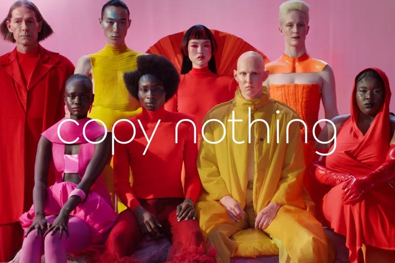
Does anyone here look happy, or at least…content?
Who are these people? What are they doing? If this is what “creating exuberance” looks like, why are none of them smiling?
Do you want to be any of them? Are their lifestyles legible? Can you fantasize about the lives they must lead, and imagine yourself—with a pang of longing—taking their place?
My guess is probably not.
But ads—especially ads about cars—are supposed to do that.
That’s why Don Draper wants a car account so badly in Mad Men. He knows that cars are potent markers of identity—your social class, your level of wealth, your family situation are all likely telegraphed by the car you drive—and objects of intense longing. The reason why they elicit so much longing is because they’re symbolically potent. They represent things that are bigger than themselves, qualities like freedom, agency, power. Like Mustangs with machismo and Jeeps with adventure.
Jaguar stands for refinement and aloofness. Part of this is the result of its British heritage. British culture is overwhelmingly one of coolness, by which I mean emotional coolness and detachment. I studied in London, I’ve lived with these people. We Americans, with our loud voices and relentless enthusiasm and gormless way of pronouncing “Gloucester,” it drives them crazy. Even their racecars place you at a cool remove. Whereas Ferraris are hotheaded and crackling with bravado, and you can feel it. Which, by the way, is why the bright colors of the Jaguar rebrand fall flat. You can have a yellow Lambo or a red Ferrari and it makes sense. But the riot of warm, searingly bright colors does not work for Jaguar. (Though the ad would still be a failure if they were wearing bright green and neon blue.) The warmth and saturation of the colors are clearly meant to evoke exuberance, but Jaguar has never been about exuberance. I get that a rebrand should change some of your brand’s associations but if it changes virtually all of them, you’re not rebranding an existing brand, you’re launching a new brand, and it would be better to just change the name to Starry and have done with it1.
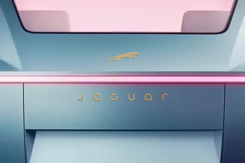
The disconnection from Jaguar’s historic heritage is why the new typeface doesn’t vibe right either. Just look at this. It looks like it belongs on a fancy refrigerator, not a British sportscar. Why did they spell Jaguar as JaGUar?
Think of even the name itself: Jaguar. I don’t think you can get away from the associations of that word as a brand name. A jaguar cat is arresting in its beauty, but like all other cats, it does not care about being liked. It slinks through the trees with the grace of an assassin. It sleeps for sixteen hours a day only to unleash itself with a bone-crunching bound onto its prey. A jaguar is entirely self-possessed and has nothing to prove.
The kind of person, then, who wants to buy a Jaguar, is a person who wants to move through the world with that feeling of nonchalance and ease. They want an object that projects the carelessness that comes with being effortlessly beautiful, powerful, and free. And they want a car that pounces, that handles as smoothly and responsively as a cat’s velvet paws. Creativity, conspicuous uniqueness (embodied in the bloodless phrase “copy nothing”), and disruption of the status quo? They have nothing to do with the reasons why people are drawn to a Jaguar specifically2.
Are nonchalance, ease, or freedom transmitted in a campaign video where people do modern dance choreography on the surface of a pink planet in garish outfits? In outer space?? With paintbrushes?? I don’t think so. Not to reiterate Elon, who is one of the worst people alive, but where is the car?
My point is, the kind of campaign that will woo the Jaguar persona is NOT a self-conscious attempt to prove that Jaguar is “breaking molds,” while lacking any proof therein of that promise….because the product that would prove their point isn’t in the ad.
You’ll notice that in my description of their true target market, those desires and associations transcend demographics and backgrounds. You can be young and want nonchalance, ease, and the pleasure of driving fast. You can be old. You can be a Black suburban mom. You can be a 38-year-old white man who works in crisis PR. You can be a gay retired hospital administrator. You can live in Manhattan, rural Utah, or Huntsville, Alabama and long for a beautiful, refined sportscar. All kinds of people, provided they have the income to pay for it, can be part of Jaguar’s story. There’s a way to market to these desires that’s inherently inclusive and aspirational. This just isn’t it.
If you’re in a glamour industry (like luxury cars) and you’re going to put people in your campaign, they have to embody the transformative effect of the product. They have to inspire both identification (this person is similar to me! I see myself in them! This is where diversity is really important in advertising!) as well as a longing for transformation (this person has a quality that I wish I did, or that I wish I had more of). They don’t have to smile, but they should look like they’re more or less enjoying themselves. They should represent a lifestyle that you know your audience wants to have. And they should use or at least reference the product that makes it all possible.
I have to go get ready now to meet my friends but I wanted to get this out quickly while people are still thinking about it.
What do you think of the rebrand? Do you hate it as much as I do? Do you want me to talk about the AI Coca Cola commercial? Do you want me to talk more about branding? Tell me everything.
This is a Sierra Mist subtweet. Starry is the stupidest name for a soda that I can think of. It feels like AI.
If I’m wrong about this, by the way, I’d love to see the market research.
As someone who has created a lot of Corporate Ids and style guides, including logos there's a bit of a disconnect with the new Jaguar logo vs logotype. The cat silhouette is timeless and correct but the logotype is awkward and off-putting. if they wanted to make it feel more modern (and sans serif) they would probably have done better to start with a Futura or a Univers and played with it to customize it for the logotype.
In terms of your playful teasing about the pronunciation that just hit the US, "JaGUar" that's actually how it's always been pronounced and marketed in the UK, so that's actually a good move.